How to Choose a Laser Cut Screen Design for Your Home’s Style
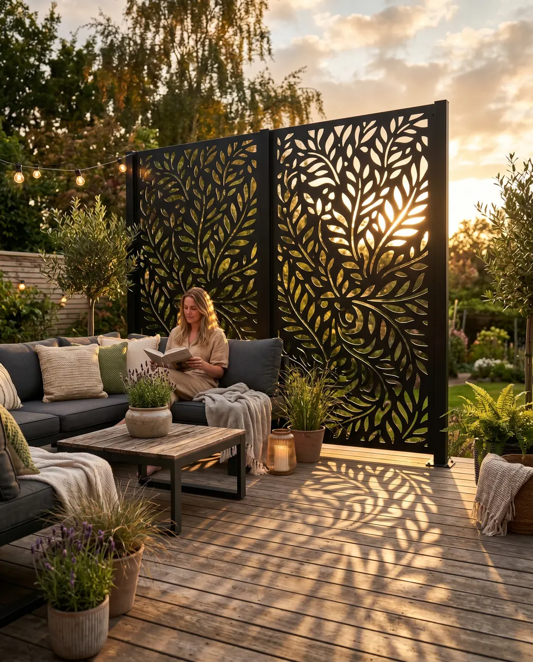
Choosing a laser cut screen design is less about finding something you like and more about finding something that works.
There’s a difference between a design that looks beautiful on a white background in a product catalogue and one that looks like it was always meant to be on your specific wall, in front of your specific façade, in your specific colour scheme. The good news is that with the right process, you don’t have to guess — and you don’t have to commit to anything until you can actually see it.
Here’s how we help customers make a decision they’re genuinely happy with.
Start With What Kind of Art You’re Drawn To
When a customer is stuck, the first thing we ask is simple: what kind of art do you like?
The answer — florals, abstracts, or contemporary geometric designs — tells us more than any description of the house does. Someone drawn to organic, flowing forms will rarely be happy with a rigid geometric grid, even if that grid would technically suit their architecture. Someone who loves clean lines and structured patterns will often find a floral design too busy, regardless of how well it might photograph. Design preference is personal, and the right screen has to feel right to the person who’s going to look at it every day.
Art preference is the filter — architecture is the context.
Does Architectural Style Dictate Design Choice?
It influences it — but it doesn’t limit it as much as people assume.
Certain pairings work predictably well: Arabic and Moroccan-inspired patterns suit homes with arched windows, plastered walls, and warm stone finishes; geometric designs complement contemporary architecture with clean lines and large glazing; organic designs work beautifully against natural materials like timber and exposed brick. But we’ve also seen pairings that looked unlikely on paper produce genuinely stunning results on site. A Moroccan lattice on a modern minimalist façade, done in the right colour, can be extraordinary.
The mock-up always tells the truth — and it sometimes surprises everyone.
Why We Never Stretch a Design to Fit a Larger Screen
This is something most customers don’t know to ask about — and it matters enormously.
When you see a design on our website, the apertures — the individual cut-out shapes that make up the pattern — are shown at the size they will actually be manufactured. If your screen is 1 metre wide or 6 metres wide, those apertures stay exactly the same size. We don’t stretch or scale the design to fill a larger panel. What changes is how many times the pattern repeats across the screen, not the size of each element within it. This is what gives a large custom screen the same refined, considered quality as a smaller one — the proportions of the design itself are never compromised.
A pattern that works at one metre works at six — because nothing about it changes.
How Colour Does More Work Than Most People Expect
Colour is not just an aesthetic choice — it’s a functional one.
The starting point is always the existing colour scheme of the house: the render, the aluminium joinery, the cladding, the roof. We try to match or complement what’s already there so the screen reads as part of the building rather than something added to it. But colour also controls visibility in a way that surprises most customers: light colours — white, cream, light grey — stop the eye. They’re more opaque to the viewer, even with an open pattern. Dark colours — especially black — let the eye through. A darker screen with an open pattern can give you more privacy than a lighter screen with the same pattern, because the eye doesn’t penetrate dark surfaces the same way it does light ones.
Colour is privacy as much as it is aesthetics.
The Biggest Mistake: Not Experimenting Enough
The most common design mistake we see is playing it too safe.
Customers arrive with a vague sense of what they think will work and talk themselves out of anything that feels like a risk. They default to the most neutral option, worry that a bolder design won’t suit the house, and end up with something that’s fine but not quite right. The reason this happens isn’t lack of taste — it’s lack of visualisation. It’s genuinely difficult to look at a pattern on a screen and imagine it installed at full scale on your wall, in your powder coat colour, next to your specific finishes.
That’s exactly the problem the visualiser was built to solve.
See It in Your Space Before You Commit to Anything
Our Room Visualiser lets you test designs on a photo of your actual space.
Upload a picture of your wall, balcony, courtyard, or gate opening, and overlay different screen designs and colours directly onto it. You can compare a geometric pattern against a floral one, test a black finish against an anthracite, and see how the scale of the pattern reads against your specific architecture — all before you’ve committed to anything. The customers who use it almost always end up choosing something bolder than they would have without it, because they can see that it works rather than just hoping it will.
The visualiser turns guesswork into a decision you can make with confidence.
Ready to Find Your Design?
The right screen design is out there — you just need to be able to see it in context.
At Deco Zoosh, we work with homeowners, architects, and interior decorators to find the design, colour, and finish that suits each specific project. Browse our range, try the visualiser on your own space, and get in touch when you’re ready to talk dimensions and specification. Every screen we manufacture is cut to your exact size with apertures that stay true to the design you chose.
Browse our laser cut privacy screens and start testing designs on your space today.